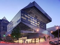
 i'm a big fan of the exterior of seattle public library's downtown branch.
the interior, however, needs some work. it still feels cold, there's no secret nook to lose yourself in a book, and, most importantly, it's exceedingly easy to get lost. i seem to remember getting lost at least once each time i visited the downtown library.
for that reason, i was heartened to read kery murakami's "Too many people getting lost in new downtown library," in today's seattle pi. the article is about seattle public library hiring wayfinder lynne faulk (a friend) to design signage to prevent library patrons from getting lost. bravo to seattle public library for hiring lynne to solve the problem - she was, after all, the one who redesigned seattle's unfathomably difficult to understand parking meters. if lynne does half the job she did with the city's parking meters, library patrons will find getting around, exploring, and finding materials at seattle's downtown library 100% easier.
my one problem with murakami's article is the way she patronizingly defines the growing field of wayfinding: Faulk is a professional "wayfinder" -- which is a fancy way of saying she makes signs. um, no - wayfinding is a lot more than that, as murakami should know, especially after writing such an interesting article about what's at play in this case of wayfinding. wayfinding is about what is being offered, what people are trying to find, and where and how the two meet. as our cities, spaces, and structures get more dense, complex, commercialized, and commodified, sometimes we need some help to just find our way. wayfinding, especially the kind i've seen lynne do with the gates foundation, seattle's parking meters, and now with the downtown library, gets us on our way and pushes us in the most interesting direction.
i'll be eager to wayfind through the downtown library the next time i return to seattle.

3 comments:
david...we didn't need professional wayfinders when architects, engineers, planners and other designers of the built environment were more sensitive to the users of spaces. they ordered space with non-verbal cues that worked.
using a library as an example...all those carnegie libraries were built in this tradition.
i believe the author was being glib. and not in the matt lauer/tom cruise glib way.
it is a funny title and task...think of it. your pal might be gifted and wonderful, but step back and think of it. at the outset, if the designers worked harder and dreamed bigger when taking up parking meters or interiors, would we need a professional wayfinder?
for real?
My first impression of this building was that it was designed to disorient.
1st - thanks, david, for speaking up about the larger goals of wayfinding. it's not just about making signs.
2nd - i actually disagree with kq - architects have never really been concerned with the way users inhabit/change buildings over time. stewart brand's how buildings learn does an excellent job of demystifying the architecture field. he suggests that architects are typically much more concerned pushing boundaries artistically, than how structures are "built" by users over time.
i do agree that designers should "work harder" when it comes to considering their audience in their designs, but i think that's really asking a lot of them. i mean, we expect them to "dream big" and be creative - but both of those tasks require a certain amount of insulation from the "outside" world. thus, having folks like your friend actually working with individuals who use these spaces to refine them over time is critical. i'm not saying that designers and architects should abdicate responsiblity for end-users - quite the opposite. ideally, there would be a fair amount of consulting/co-design with those people inhabiting these spaces over time. however, it is unlikely that the role of "wayfinder" or "information architect" can or should be fully replaced by the person responsible for the original conceptualization.
3rd - there's a great chapter in the "information design" book (edited by robert jacobson) by roger whitehouse that discusses the design of signage for a space used by individuals with varying levels of visual acuity. they designed signage for individuals who 1) had been blind since birth and knew how to read braille, 2) had been blind only for a few years and didn't know how to read braille, 3) older adults whose vision was failing, but who were not legally blind, 4) individuals with color blindness, and 5) fully sighted individuals. no one person (not even a brilliant designer) would be able to fully intuit the types and variety of signage each one of these individuals would need. further, the key point of this article was the idea of collaboration - that you can't just go out there, build a building, leave, and expect that those inhabiting it will be able to use it the way you intended it to be used.
4th - one of my issues with the seattle pl is the book spiral, which is one of those "it seemed like a good idea at the time" ideas. while visually intriguing, it's incredibly hard to use if you're actually trying to find books. additionally, i find the lcd colors in the elevator jarring and at serious odds with the seattle environs. it's clear that rem was somewhat unaware as to how uncomfortable it is on the eyes to go from the dark, gray city streets, to the electric/flourescent green of the elevators.
i'm not sure if any of this makes any sense, but it's something that's near and dear to my heart. i guess dissertations tend to do that.
Post a Comment